Designing A Festival Schedule App
The festival season is officially a go! With Glastonbury kicking off this weekend and the great lineup of festivals coming up this summer, we thought we would take a look at how mobile-friendly some of these UK summer festivals are.
After looking at some of the best known events, the verdict is that music festivals have a long way to go to catch up with the mobile-first world we are living in. However, a few are worth mentioning for their development of some great festival apps.
In this article we take a look at the apps of five UK festivals and just how well-designed and effective these are.
WOMAD (2014 app – currently unavailable)
The good: Delivers essential information and includes a planner.
The bad: Inability to switch between sections without returning to homepage.
Design
WOMAD is a very well known yet ultimately not that large festival, so spending lots of money on an app probably wouldn't prove that beneficial.
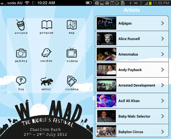
The app reflects this with a simple design that does what it needs to do: deliver essential information without all the frills.
The app revolves around a simple yet solid home menu with icons leading to the different sections of the app. The only downside is the inability to switch between sections without returning to the homepage.
In terms of social media, the app integrates with Twitter and Instagram.
Content
The app contains sections with information about artists, the program, a planner, site and camping maps, FAQs and news.
The artists section has an A-Z of all performers with information about them, scheduled slots and links to their social media pages. Alternatively, the program section shows all performers by time or stage.
The planner allows you to create your own lineup and email it to your friends, with push notifications to inform you when an act in your planner is about to perform.
As for the maps, these are simple PDF maps and therefore not interactive, but they contain all essential locations. As a bonus the app includes a map of the camping sites which many festival goers will probably be thankful for.
The verdict
The WOMAD app is a basic but useful app. However, it's a shame that the app design doesn't reflect how beautiful the festival site is.
Bestival (2014 app)
- iOS and Android
The good: Gorgeous flashy app.
The bad: Not actually very useful for festival goers.
Design
Bestival is a large festival that attracts more than 60,000 people a year, so you would expect them to be able to afford a good festival app.
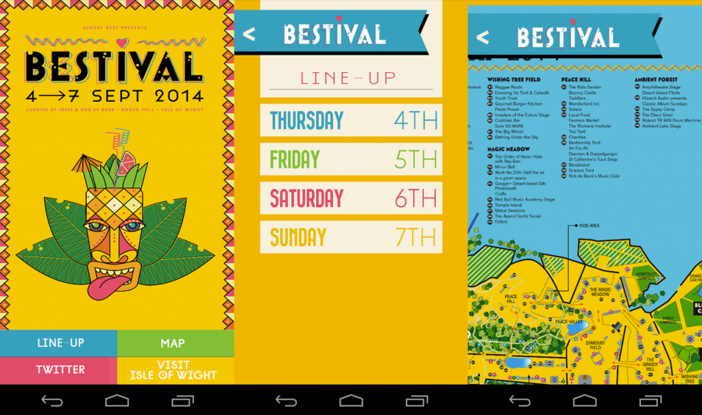
Unfortunately expectations fall short; the Bestival app is more frills than thrills. It is a colorful and flashy app that is visually attractive, but its actual functionality is not really that helpful.
The app's design is simple with a small home menu that is only accessible from the home screen.
However, where the design really fails is in its lack of offline functionality. Bestival has notoriously poor phone signal so only being able to access content while online is a major issue.
Content
The content unfortunately doesn't really make up for the poor design. In fact, the only useful content on the app is the lineup, which only includes act names and times but no artist information.
There is no essential festival information available; instead there is a whole section on Isle of Wight tourism which will be pretty irrelevant to Bestival goers.
The site map is non-interactive but it is pretty thorough and has good zooming functionality.
The verdict
Overall a disappointing app considering how great and tech-savvy we have come to expect Bestival to be. Considering the potential size and reach of the app, they have done a poor job by focusing on making it look flashy rather than functionable.
T in the Park (2014 app)
- iOS and Android
The good: Great interactive map.
The bad: Bad design and information overload.
Design
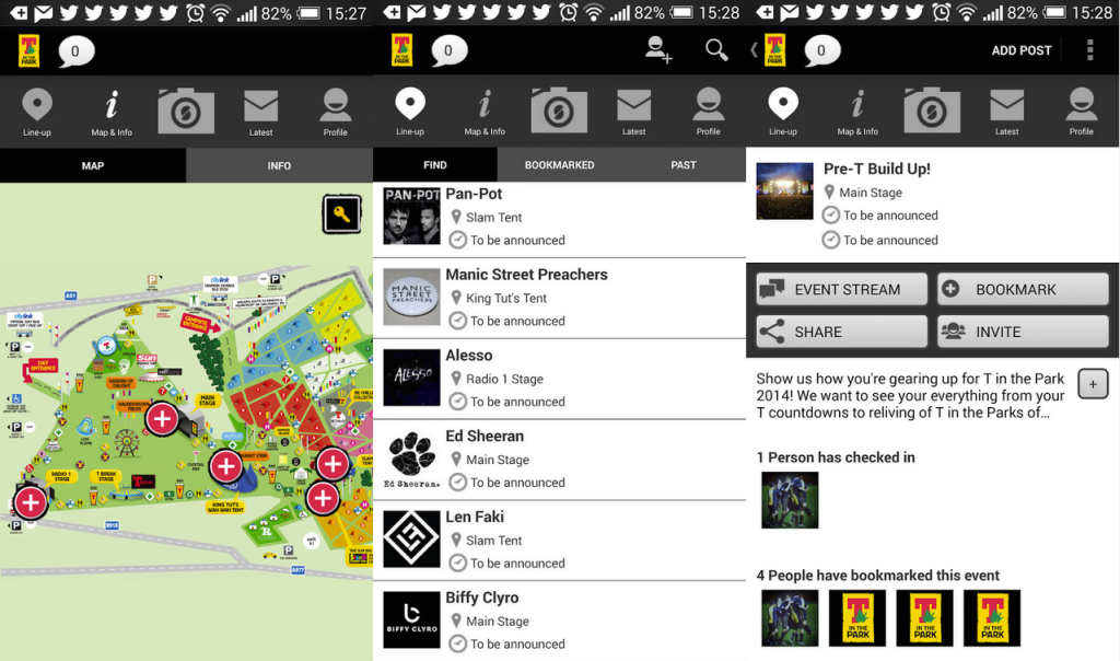
The first thing you notice when you open the T in the Park app is that you need to sign up. This annoying obstacle will mean that many users won't even bother with it.
If they do persist, however, the next thing they will notice is that they need the internet to be able to sign up, which at a festival with poor mobile reception may prove impossible. Not to mention the amount of precious battery power it will drain.
If there's anything that app makers of the world have learnt is that users hate waiting. They like accessing information as fast as possible and having to wait for the Internet to load is not normally conducive to this.
Other than that, the app design doesn't get much better: it is hard to navigate, confusing and its content is all over the place.
Strangely, the app contains a photo-taking functionality, which is completely pointless.
Content
The app's content unfortunately leaves a lot to be desired too.
A lot of random information from latest news and videos to essential festival information can be found in the app, but this is scattered all over the place making it difficult to find the right information.
On the other hand, the festival site map is probably the best out of all five apps in this article, which makes you wonder if that is where most of the app budget went.
The map is interactive, allowing you to zoom in and explore the different areas of the map as desired. The best part is that you can click on each stage to find out who is playing there at the moment, a delightful feature that will allows festival goers more spontaneity.
The verdict
From the start, T in the Park's app is simply annoying and difficult to navigate. Making the interface simpler and allowing users to use the app without the need to sign up are the first steps T in the Park should take to improve their app.
Wireless (2014 app)
- iOS and Android
The good: Interactive map and planner.
The bad: Too many clicks necessary to navigate.
Design
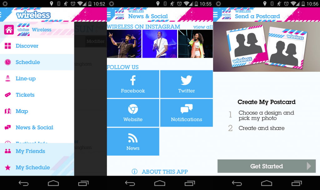
Opening the Wireless app for the first time is a bit confusing – the app automatically takes you to a 'Discover' section containing random artist profiles and videos. At this point, many users are likely to abandon the app because of the absence of an obvious menu to navigate.
Those slightly more tech-savvy users, however, may notice the little button on the top left corner, which upon clicking opens up a menu, allowing to navigate to the other sections.
The app doesn't work offline, probably less of an issue due to its being an urban festival, but still an issue. However, it does include push notifications, allowing uses to keep updated on the acts in their schedule.
In terms of social media, the app connects with Facebook and Twitter.
Content
The app's content includes the usual suspects: news, festival info and lineup, with the ability to "star" acts of choice to add to your schedule.
An added quirky feature is the ability to create a digital postcard to save to your device or share on social media.
The app also allows you to log into Facebook and find your friends and look at their schedules.
The festival site map is interactive, with the ability to click on locations and find out what they are and what events are taking place there.
The verdict
Again, considering the size of the festival Wireless could have done a much better job with the app. Although the content is good, the app could have been designed a lot better and made more user friendly.
However, the app is promising and hopefully will be improved for the 2015 season.
And the winner is… Glastonbury 2015 (currently unavailable)
The good: Great planner, thorough information, 'pinning' functionality.
The bad: Not much information about each act.
Design
As one of the largest festivals in the world, the Glastonbury app developers clearly had quite a budget to throw at the app. With EE as its main sponsor, this was probably even more the case.
As it turns out, EE run 4G connectivity across the site and have several charging stations on site, so festival goers can rest assured that they will be able to enjoy the app without running out of battery.
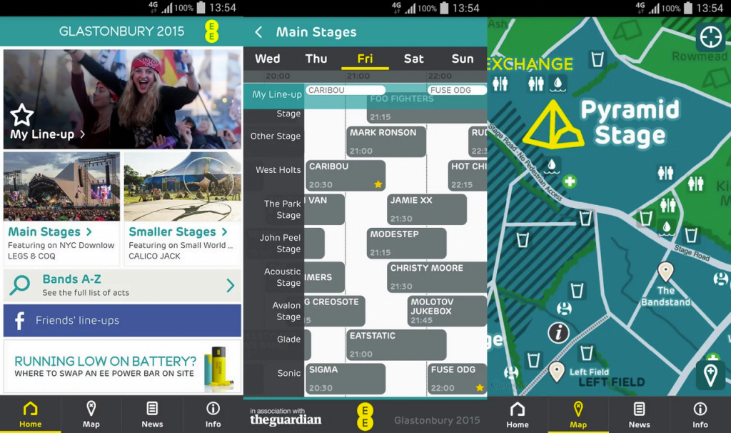
The app design is simple yet thorough. Its most prominent section is 'My Line-Up', which is undoubtedly going to be the most used section of the app.
The app contains crisp images and is clean looking. It's very easy to navigate, making it as convenient for users as possible.
Content
As for the content, the app contains pretty much everything you could possibly need, from essential information to a packing list.
The lineup is divided between 'main stages' and 'smaller stages' and the list of acts can also be found in alphabetical order.
Acts can be clicked on and added to 'my line-up' or viewed on the map.
'My Line-Up' allows you to clearly visualise the acts you wish to see in a timeline, and you can also connect to Facebook to check out your friends' lineups.
The map contains all locations you could possibly need, and zooming functions work well, but unfortunately it's not a very interactive map.
However, it does allow you to pin locations such as where your tent is, or to share locations with your friends in order to find each other. This pinning feature will undoubtedly make festival goers' lives easier.
There is also a news section with festival news and tweets.
The verdict
Nothing bad can really be said about this app. Glastonbury are clearly the pioneers when it comes to festival apps and other festivals should follow on their steps.
The Glastonbury app is clearly thinking about the user first and catering for their needs both in terms of appropriate content and good user experience.
Even better, the app is only one part of Glastonbury's great mobile strategy, with connectivity and phone charging being a big deal on site.
Connectivity is so good that apparently users were able to stream Spotify music last year. Way to go, Glastonbury!
In conclusion
There is still a long way to go until music festivals catch up with the mobile-first world and offer valuable festival apps to attendees.
Festivals such as Glastonbury are leading the way, but other festival apps currently leave a lot to be desired.
However, all festivals providing apps must be commended on taking the first few steps towards better connectivity, and I am sure that the next few years will see better and better apps being offered as festivals realise what their users' mobile needs are.
In order to allow users to get the most out of festival apps, we would suggest that these apps focus on:
- Offline functionality to ensure festival goers have access to essential information in case of poor phone signal.
- Ability to access information in as few taps as possible.
- Intuitive menu that is accessible from any screen.
- An interactive map that allow users to find out what's happening at each stage, with ability to 'pin' and share locations.
- Personal planner to help festival goers plan their experience, preferably with push notifications to remind them of coming up events in the planner.
There is no doubt that there is great potential for festival apps and that in the near future they will become a central part of the festival experience.
But some festival things will truly never change: great music, rain and muddy muddy wellies.
Designing A Festival Schedule App
Source: https://fliplet.com/2015/06/24/festival-apps-good-bad-ugly/
Posted by: nixonyones1946.blogspot.com

0 Response to "Designing A Festival Schedule App"
Post a Comment